Settings
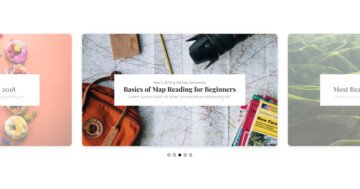
The Magazine slider looks super special, but it’s based on the most common slider type. That’s the simple type, which can display one slide at a time. This is why you can see a full set of new image boxed after slide switching.
Speaking of slide switching, it’s possible it three ways. Firs, using the arrows which are outside of the slider. It’s a common way to use simple type sliders as headers, which needs the sliders to be full width. But this slider is not full with, it’s boxed. A boxed slider does not fill the screen, but the container it was put in. That is why the outer positioned arrows are visible.
The second way of navigation is the bullets at the bottom of the slider. Apart from being cool navigation tools, bullets have another important purpose. They show all available slides. The last way you can browse the slider is swiping on touch screen devices. A swiping action is natural on touch screen devices, so this gives a great user experience. Also, if you have a mouse, you can drag towards the direction you want to switch to.
Layers
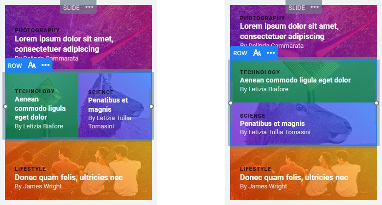
You can find headings, rows and columns on this slider. The heading layers provide space to display the category, title and author of the post. For this reason the Magazine slider is suitable for creating a post slider. To be able to display the 4 post details inside a single slide, make sure you set the Group result option.
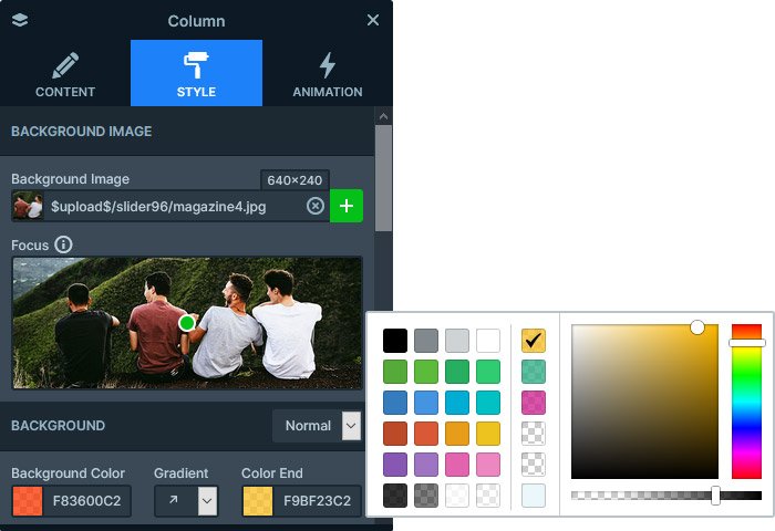
One of the most spectacular parts of the Magazine slider is the gradient images. How to create such effect? Go to the column, and set a background image. Then choose the gradient direction. Finally, set a semi-transparent background color for the start and end color.
Animations
There are no layer animations on the Magazine slider. In fact, the only animation is the Main animation, which is responsible for the horizontal sliding effect when the slides change.
Layout
The layout of the Magazine slider is built with rows and columns. The main container is a two column row, which is stretched to cover the available space on the slide. The left column only has the textual layers. But inside the right column, there are two other rows. The top row has two columns, but the bottom one has only one.
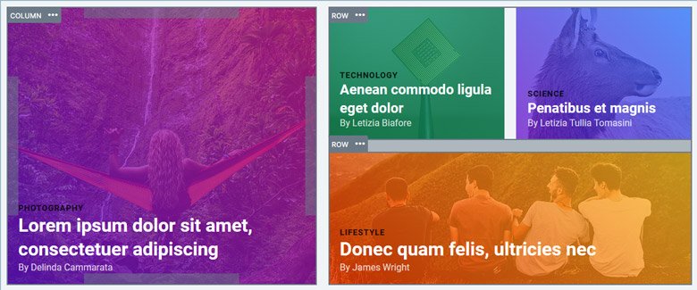
The Gutter option of the rows’ creates distance between the columns. But the bottom row inside the right column has a top margin for the same purpose.
Responsive
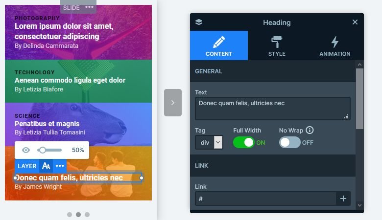
The Wrap after option of the row decides how many columns can fit next to each other. On mobile this value is set to 1 by default, which means every column will break into a new line. The Magazine slider is an excellent example for this behavior. The rows and columns which are next to each other appear one after the other.
If your text sizes are too big or too small on mobile, you can use the Font resizer to adjust it. This tool helps you achieve the perfect text size for mobile. Additionally, it’s always at hand as it’s available on the Responsive bar.
Related Documentation: How to use a demo slider in your generator
Related Post: Enrich your Blog with a Post Slider