Settings
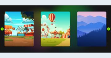
At carousels you can show more slides next to each other at the same time. It can be useful if you would like to feature your latest posts. You can use the WordPress Posts generator, and your Post carousel will dynamically refresh.
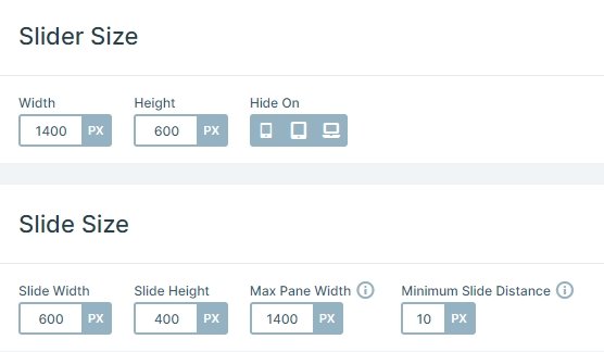
This slider displays 2 slides at the same time. This is because of the size settings. The width of the slides are 600px, the size of the slider and the pane are 1400px, so 2 slides can be visible in one pane. If you want to display more slides, then you can decrease the size of the slides.
Layers
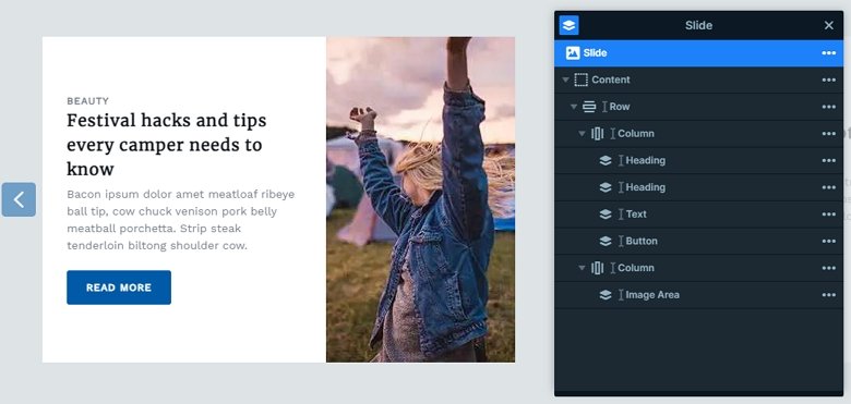
On this sample each slide has 1 row – 2 columns structure, at the left side are heading and text layers and a Read more button. With this Call to Action button you can make an interaction with your visitor, and navigate to the Post. At the right side is an image area layer, where the Fill mode is used. Fill mode will make the image as big as it needs to be to cover the area.
Animations
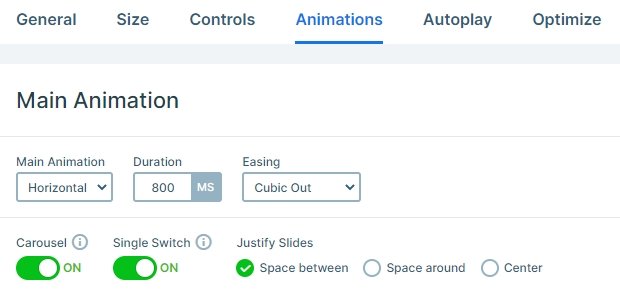
When you switch to the next or previous slide, the next or previous slide will come in with a horizontal animation. This animation is the main animation of the slider. The carousel option is enabled at the slider. This option will create a complete round from your slides if you have enough slides. So you can go to the first slide from the last one.
Layout
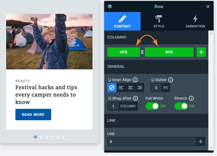
Each slide has the same layout, there’s a row with 2 columns with 40-60% width. The left column contains the textual elements, and there’s an image in the right one. You can switch slides in 3 ways: with dragging your mouse, using the arrows or using the bullets on the bottom. These controls give a frame to the slider, and helps at navigating, also shows how many slides are in the slider.
Responsive
When you check the slider on mobile devices, you can see there are elements which aren’t visible. The arrow control is hidden on mobile, so there are more space on the left and right sides. The text layer is hidden, too, so the slider isn’t too tall on mobile. By default the rows wrap after one column on mobile, and the left side goes to the top, and the right side to the bottom. But you can change this order at the settings of the row by dragging the green boxes which represent the columns.
Related Post: All You Need To Know About Carousel Slider Type
Related Post: Enrich your Blog with a Post Slider
Related Post: 10 Beautiful Full Width Slider Examples