Settings
The Minimal Logo Slider is a carousel. The carousel slider type is a special kind of slider, that can display more slides next to each other. On this slider you can see 4 slides together in each pane. The term “pane” refers to the group of slides that are visible together.
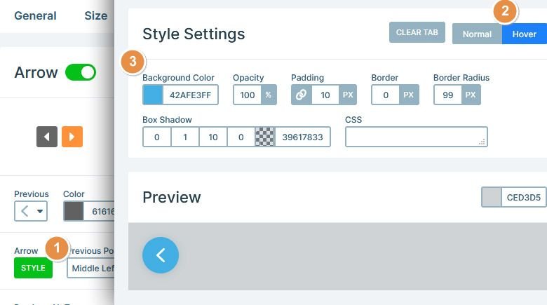
Being able to conveniently navigate on the slider is important. For this reason, the Minimal Logo Slider supports three kinds of navigation. First, there are arrows on the sides of the slider. These arrows change their white background color to blue on hover. To change the hover color, you need to follow three simple steps. First, click on Arrow – Style (1), then switch to Hover (2) and pick the background color (3).
On the bottom of the slider you can see small dots. They’re bullets, and the second way to navigate on the slide. Bullets can fill two purpose. First, they allow switching slides fast. Second, they indicate how many slides there are to see.
The last kind of navigation on the Minimal Logo Slider is the touch and drag actions. Creating a mobile friendly slider isn’t just about having responsive content. It’s also about creating an amazing user experience on mobile. Swiping actions are natural on touch screen devices, so they make it comfortable to browse the slider.
Layers
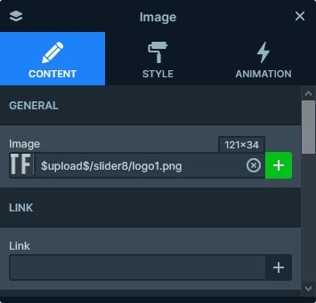
You can find three layers on the Minimal Logo Slider. There’s a one column row, and inside the image layer with the logo. The logos on this slider are 121x34px. Since you’ll probably want to replace them with your own, you’ll be happy to find their size at the image layer. Look for the size option at the top right corner of the image URL at the Layer Window.
Animations
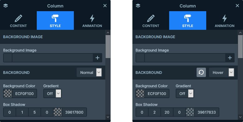
There’s a cool effect you can see on the slider if you hover on any of the slides. The slide gets a nice shadow, showing that your mouse is above it. This effect isn’t actually an animation. In fact, it’s a simple box shadow that we set at the column on hover.
Layout
The layout of this slider is very simple. There’s a row, with a single column, and an image layer inside this column. When you add a new row, by default it will have two columns. To have a one column row, you’ll need to remove one of the columns. You can do that for example, from the Layer window. Simply right click on the unnecessary column and select Delete.
Responsive
Carousel sliders have great responsive behavior. The smaller the slider the less slide they show. As a result, they display one slide on mobile. Additionally, the images in the slides will look great, because they’re Default positioned.
Default positioning is a special layer editing, what you won’t find in any other slider software. It’s a relative positioning, similar to the way page builders work. As a result, you can build your slides fast using Default positioned layers. More importantly, these layers will need very little responsive adjustments.
Related Post: How to Create a Stunning WordPress Logo Slider
Related Post: All You Need To Know About Carousel Slider Type