


Settings
The Flower Shop is a full page slider, so it fills the 100% width and height of your browser. The slider stays from 3 slides, and it autoplays every 12 seconds. You can see the slider autoplay indicator in the top right but you can switch slides by dragging or with the thumbnails on the right as well.
Layers
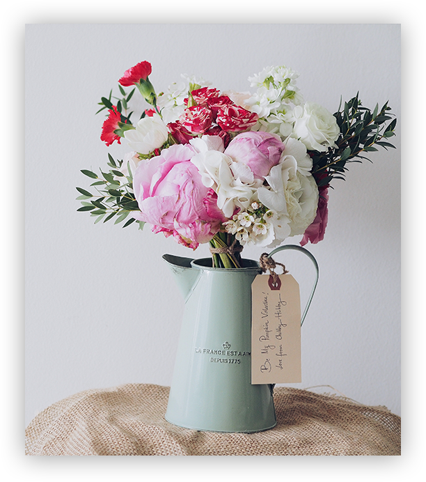
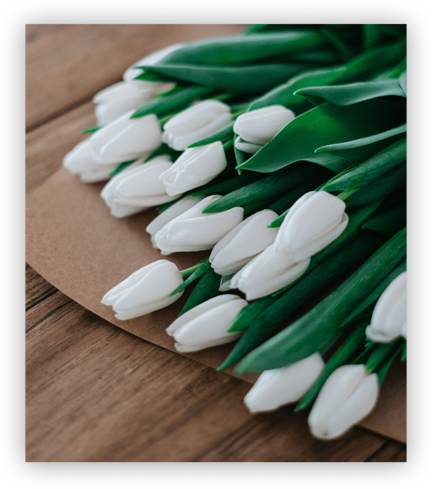
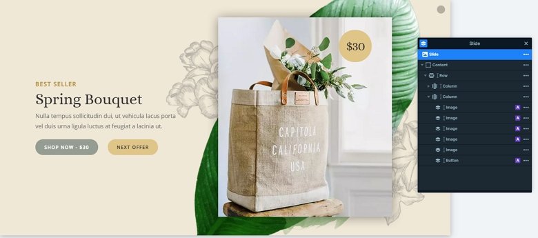
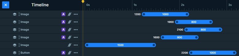
The slider has simple layers. There are 2 heading layers on the top, then a text layer comes, and finally 2 button layers. On the right side of the slider you can see more image layers which are on the top of each other. And in the top right there is a button layer which has rounded corners and displays the price. The image layers are in absolute position, which can be useful at decorating the slider.
Animations
The textual layers are coming in with a nice looking reveal animation. This kind of animation looks good, and cheers up your website. The images also have layer animations which are coming after each other. You can harmonize these animations together in the timeline.
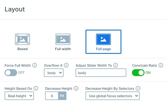
Layout
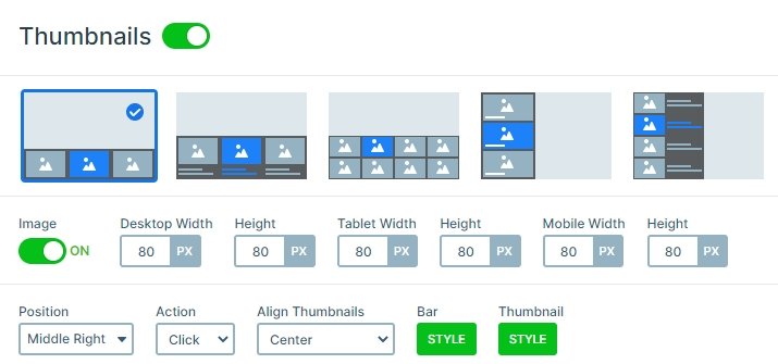
The slider has a simple layout: there is a row with 2 columns. The left column contains the textual layers, the right the images and the button. You can see the autoplay indicator on the top right, and the thumbnails on the right side of the slider. With the thumbnails you can switch slides. They are rounded, and have an opacity if they aren’t active.
Responsive
If you check the slider on mobile you can notice the images in absolute position are hidden. They are used only with design purpose, and with hiding them you can save space on the slider in smaller views. Also, you can see the texts are smaller. You can set the text sizes with the text scale, which is a device specific setting.
Related Post: What is a Full Page Slider and How to Use it?
Related Post: Use Beautiful Layer Animations in Smart Slider 3 Pro