


💡 Best features in this slider
Settings
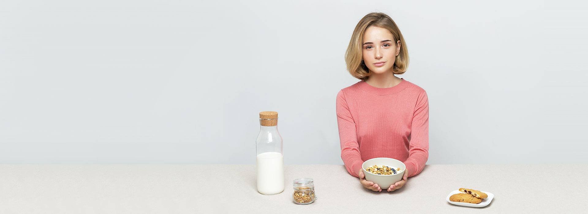
The Cooking sample is a fresh and modern slider for your food blog. This is a full width slider, so it fills the available horizontal width, so can be a great hero header.
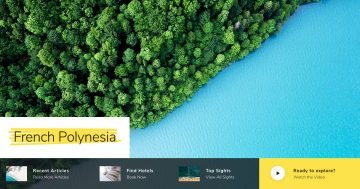
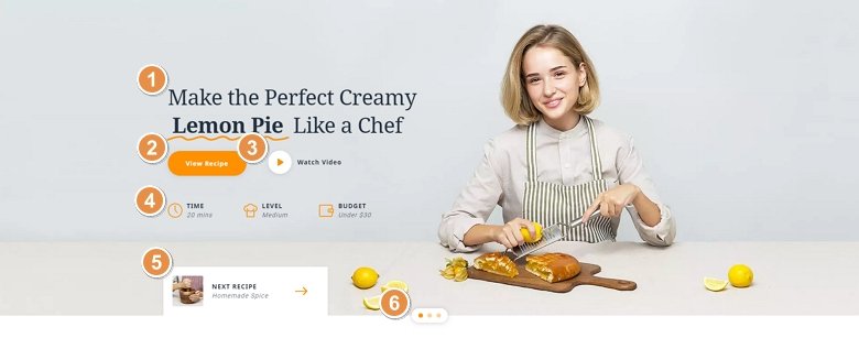
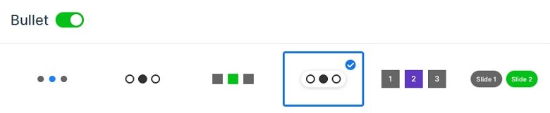
Instead of using the standard arrows, we created a nice looking navigation box. The box contains an image, a title and a description with a nice looking next arrow. If you click on it, you can switch to the next slide with a link action. Also, you can switch slides with the bullet control on the bottom or with a simple mouse drag.
Layers
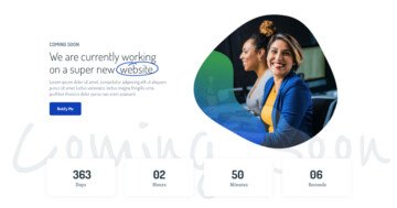
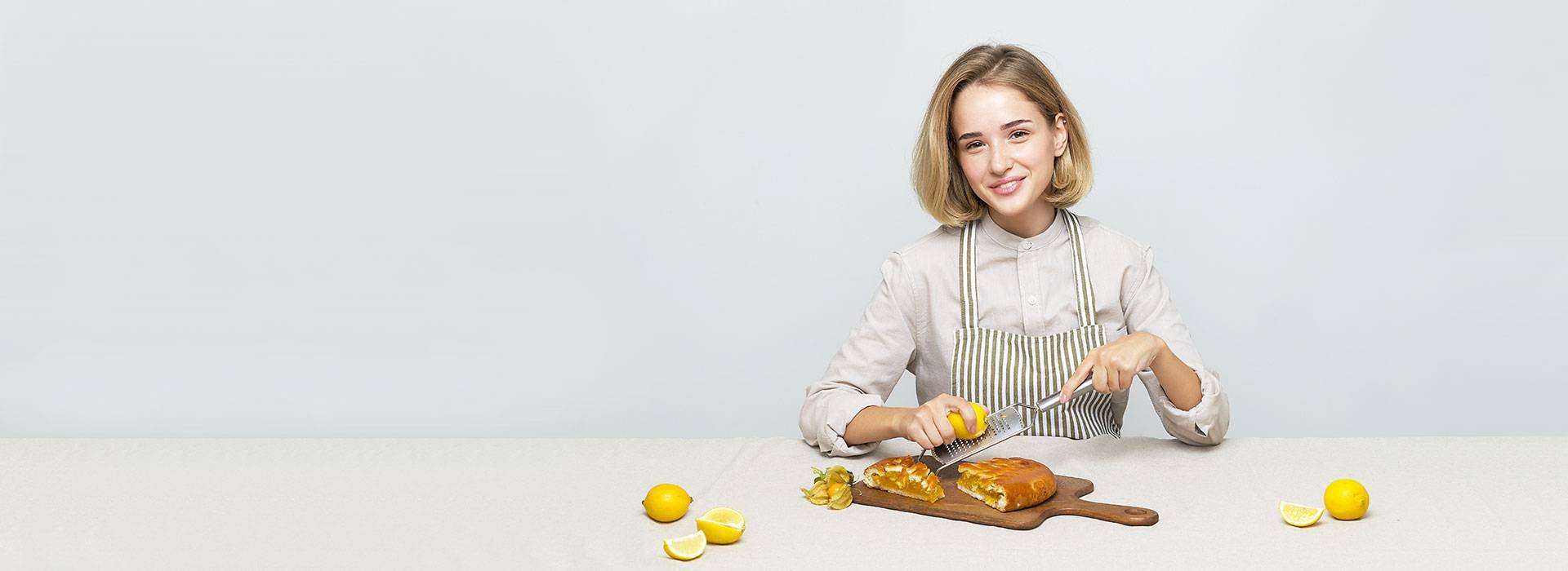
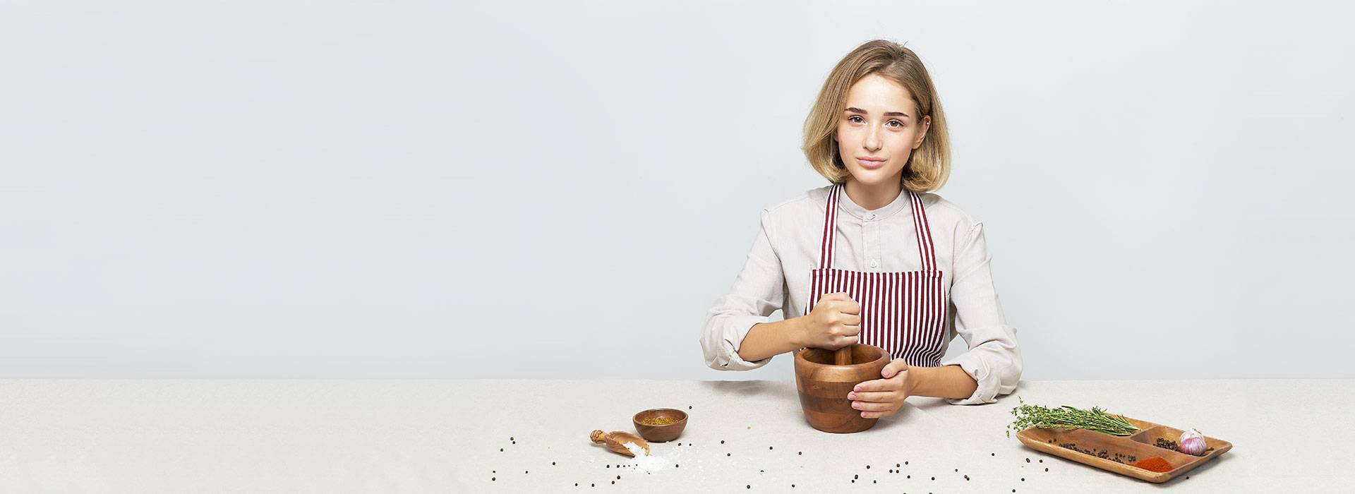
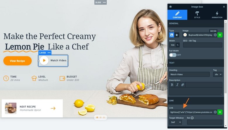
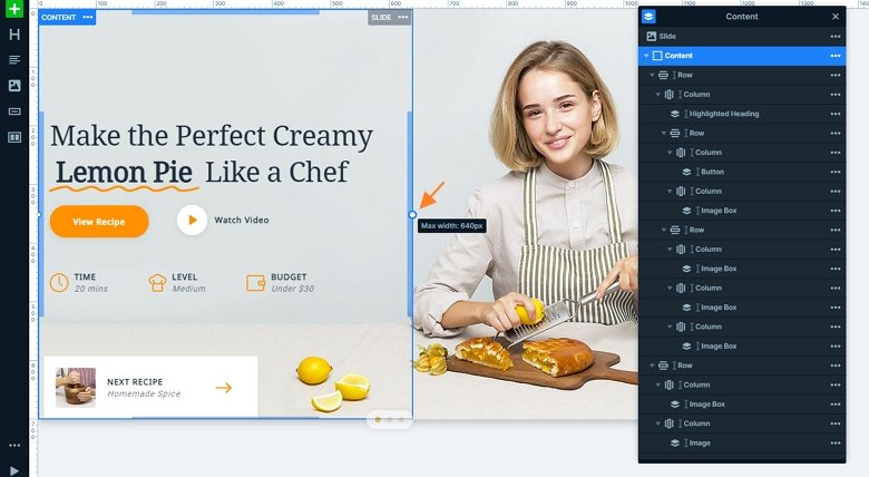
You can meet with a lot of interesting layers in this slider. The most noticeable layer is the highlighted heading. This highlight is different on each slide, but always calls the visitors attention. The most used layer is the image box in this slider. We have used it 5 times with the left layout, so the image is on the left, and the text is on the right side. The first image box contains a link, and if you click on it, a video opens in a lightbox. The last one also has a link, it uses a link action, and navigates the visitor to the next slide.
Animations
The slider features the highlighted heading layer which you can use to center your visitors attention. It highlights your heading with a nice animation. After this the animation box comes in with a layer animation. If you click on it, you can switch to the next slide. When you switch slides you can see the new slice background animation, giving a nice touch to the slider.
Layout
The slider has a special structure, the layers are in rows and columns. With using rows you can put layers next to each other. The Content layer has a maximum width, so the whole content will be in the left side of the slider.
Responsive
If you check the slider on mobile, you can see there are layers which aren’t visible. They are hidden and with that you can save space, and your slider won’t be too tall.
Related Post: 10 Beautiful Full Width Slider Examples
Related Post: Introduction of the Brand New Highlighted Heading Layer