Settings
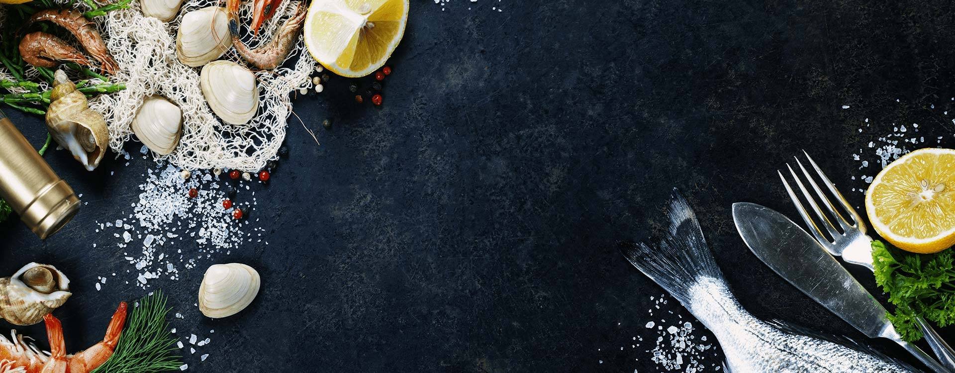
The Recipes Block is a block type slider, so it has only one slide without any controls. It can be a great hero header on your page, but you can use it as a section, too. The block is full width, so it fills the 100% width of the screen.
Layers
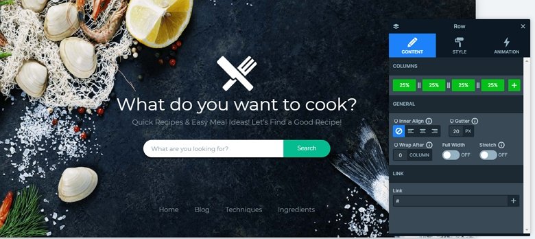
The block has more layers: there is an image layer on the top, then 2 headings and an input layer. Below the input layer you can see a row with 4 columns, and each column contains a button layer.
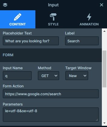
You can use the input layer to create a fancy HTML input, where people can write what you need. It can be used to allow search on your site or subscribe to your newsletter. You will need some coding knowledge though to handle this information.
Animations
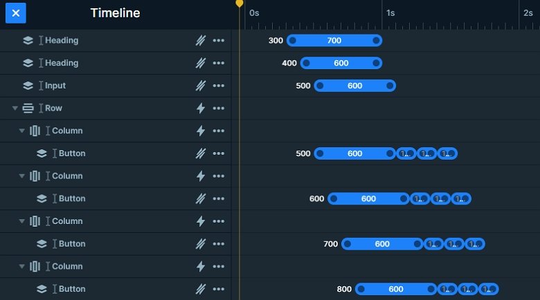
When you refresh the page, you can see the layer animations. There are special layer animations on the layers which are eye-catching, and cheers up your page. These animations stay from more steps. You can harmonize the animations in the timeline, where you can see all of the animations in the slider.
Layout
This demo block has a simple layout: the image, headings and input layers are under each other, and then a row comes with 4 columns. You can see a button layer in each column. You can put a link on these buttons which you can navigate to another pages or you can use them as an anchor.
Responsive
This Recipes block looks good on every device. The row has a wrap after value on mobile, so after 2 columns the row wraps, so 2 columns are in a row. With that the buttons have enough space, and the visitor can click on them.
Related Post: Use Beautiful Layer Animations in Smart Slider 3 Pro
Related Post: 10 Beautiful Full Width Slider Examples