


Settings
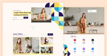
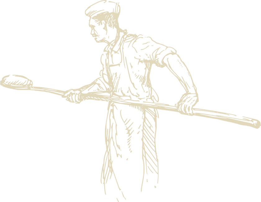
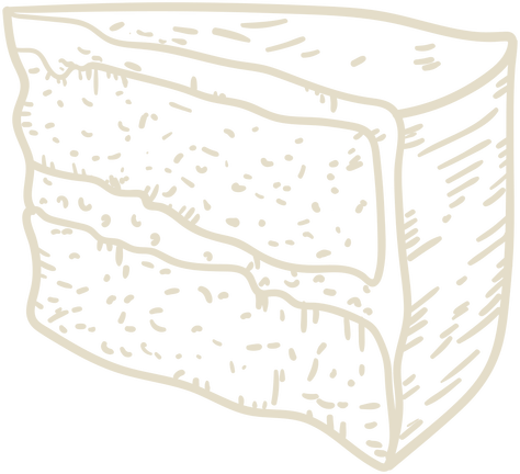
If you have a company it is useful to have your own website on which you can give information to your visitors and your business can also be easily found. The bakery page example is a great demo that you can use on your one page website. This landing page consists of 5 sliders which you can fully customize to your needs.
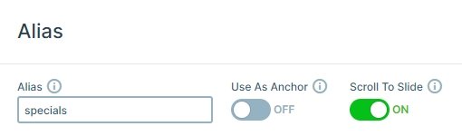
The bakery slider group starts with a navigation on the top. Here you can see a logo image, the menu, and 2 small icons on each side. With the menu, you can navigate to other sliders using the ScrolltoAlias action. In the group, each slider has an alias, which can be useful at the navigation.
The next slider is a simple full width slider with 3 slides. The slider switches their slides automatically with the slider autoplay. Small but important settings are the arrows and the bullets. In this slider, the text type arrow and the number type bullet are used which give a special navigation effect for the slider.
Layers
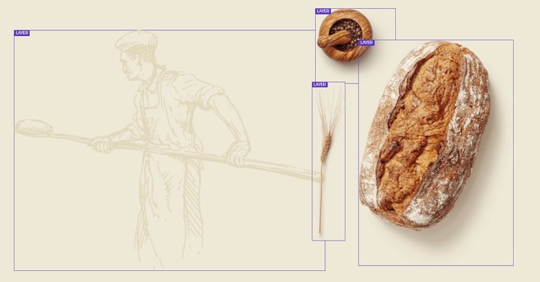
The first slider is a good example of how you can use the default and absolute positioning together. The textual layers are in default position in a 1-row 2-cols structure, and the images are in absolute position.
The image layers are in absolute position where you can position your layers anywhere in the canvas, and you can put a layer above or below to others.
Animations
When you scroll on the page you will notice that almost each slider uses animation. My favourite is the Bakery slider on the top, where the first col has an incoming animation, and there is a CTA which calls the users’ attention. The second col has 2 heading layers and they have a text animation which gives a nice visual effect.
The image layers come in with a nice layer animation, too, so when the visitor sees the page first, they can read the text below them, then the images come in.
The about block is simple but spectacular because of the parallax effect. Thanks for the fixed slider background you can make a great visual effect on this slider block. You can set the background image to fixed at the Slider settings.
Layout
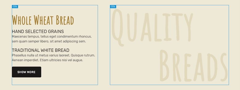
Each slider uses a different layout, but the most interesting is the Specials block. This block uses a grid layout, which consists of 2 rows. In the first row there are 3 columns and in the second row there are 2 cols.
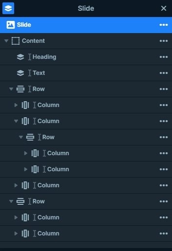
The first row is special because in the second column another row with 2 cols is used. At this row we have used the wrap after value, so after 1 column the second begins in a new line.
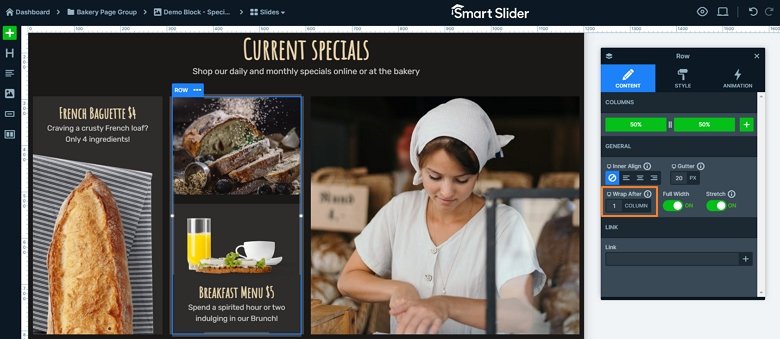
The grid where the textual layers are has a column background color which can change on hover to the color of the slide background giving a special effect to the visitor.
Responsive
The Bakery page is fully responsive, and looks good on tablet and mobile devices. We have used the Text scale at each device which we made the text smaller, and there are sliders where layers are hidden in small devices.
Related Post: How to Create a Cool Text Animation
Related Post: How to Create Beautiful WordPress Landing Pages That Convert
Related Post: 12 Stunning One Page Examples Which You Should Check