When Smart Slider 3 was designed, we took special care of making it as responsive and mobile friendly as possible, while keeping the settings simple and easy to understand for everyone. We also made sure that no one has to write a single line of code when making a responsive slider, so every option that makes your slider 100% responsive is available in our intuitive interface.
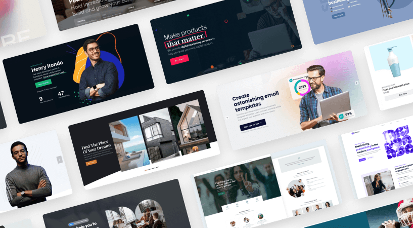
In this article, I’ll introduce the most useful options and settings in Smart Slider 3. Take a look at this slider checklist, and create a good working and well designed slider for your WordPress or Joomla website.
Before you start creating your slider, the first thing you should do is to plan your slider. These 5 questions can help you start before editing.
What is your goal with the slider? This is one of the most important questions what you should know the answer for. Do you want to use it as a design element, call the user to an action, or do you want to make a gallery?
Where will you put the slider? Will it be a homepage slider, a carousel at your product page, or do you want to put it into your post?
What will you put into the slider? If you have the text and the images before you start creating your slider, you can save time.
How many slides do you want? Do you want to create a hero block with one slide, or an image slider with a predefined number of slides?
Take the time and answer these questions before you start to create your slider. It will make the editing easier and it is also important for creating a successful and well prepared slider.
2. Slider sizes
Setting a good slider size is a critical point in creating a slider. This value will define your slider size ratio, and the responsive sizes as well.
Set an optimal slider size
It is important to set an optimal slider size with which you will work. Don’t work with too big sizes. An optimal size for a slider is 1200px width and 500-800px height. In fact, we work with these numbers in our templates as well. Additionally, a smaller slider size makes it easier to edit your slider.
Choose the right layout
As every device has different size, setting the right layout is critical in creating a slider. The slider size defines the slider size ratio, but the layout defines how your slider should behaves on different screen sizes.
Full width layout with 1200px slider width (left) and 1920px width (right)
If you use Boxed layout then the slider can be as big as the container it’s in. If the Fullwidth layout is selected, the slider tries to fill the space between your browser’s left and right side, so the slider will reach outside of its container if needed. However, the height will be calculated based on the set slider size, so it won’t fill the browser window vertically. If you want your slider to have 100% width and the height of your screen, you can use the Full page layout.
Set limits
If you set a slider size, it will change with the screen. It can happen that your slider content will be too tall or too wide. To avoid that behaviour use the Limit Slide Width option. This will only restrain the width of the layers, but the background image will still stretch out to 100% width if your slider uses Full width layout.
🎓 Use almost the same amount of content on each slide. When you use Default layers, the height of your slide is based on the layers inside. And the height of the whole slider is defined by the tallest slide.
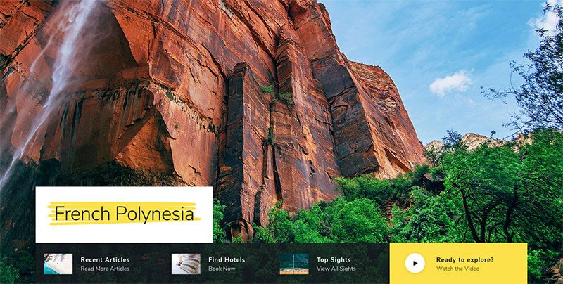
3. Slider images
A well chosen slider image has a big impact on the visitor. It’s important what kind of images you use. There are more things you should pay attention if you want to create a good-looking and fast loading slider.
Use an optimized image
To create a good slider, it is necessary to pay attention to the quality and size of the images. A large image can slow down your slider’s speed, and it can be disturbing. You should pay attention that a small image can have a big size too, if its quality is too good. Above a particular level of quality people’s eyes can’t see the difference, so don’t use images with too high quality.
Set a device specific background image
It can happen that your background image looks and works perfectly on desktop, but not on mobile. Or it looks good also on mobile, but it’s loads slowly. Your mobile users should not load a wide and big image for their small screens. To avoid that you can set different images for each device in the Pro version of Smart Slider 3, which will reduce the loading time, too.
4. Content
To create a good responsive slider you should pay attention to the content of your slides. Your content is the reason why people come to your website. With Smart Slider 3 you can use a lot of layers such as heading or text layer with which you can build up a good content to your website. Media contents are also important, with a video slider you can grab the visitors’ attention as well.
Layout
Using a structure can be familiar from page builders. With rows and cols you can build up your slider, and it can help you align your layers, too. I can suggest that you should always use the content mode and a structure, it will make the whole building process easier.
Set a wrap after value
If you build up your slider with rows and cols, you can set breakpoints where the col should wrap. This setting is really useful on mobiles where you can put the cols under each other.
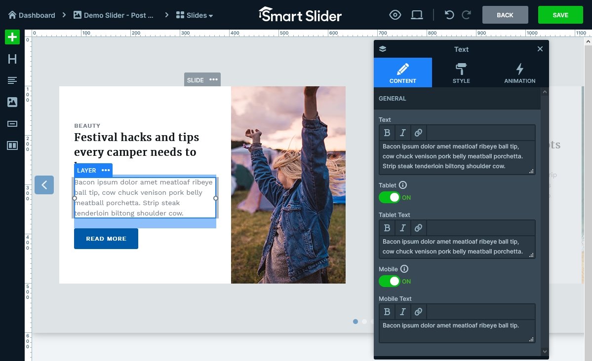
Different text length for every device
While a long text fits well on a large layer on your desktop slider, it is very unlikely that it will fit and look good on mobile. The text layer has a special option that no other layer has: it is possible to create device specific texts that can be managed on one layer.
With text layer you can set different text length for every device
5. Style
A good design can be an important point in a website. It is necessary that the visitor can read all the content on desktop and mobile devices as well. To create a clean but modern design try to maintain harmony in your slider. In other words, avoid using too many font families or colors.
Check the responsive views. Always take a look at the mobile and tablet view, and make changes if it is needed.
Keep the harmony. Use matching colors, and font-families.
Avoid too much text. If you put too much text in your slider, the visitors won’t read it. Place a CTA button with a short text instead and navigate your visitors to another page.
Mix the editing modes. Content mode is the best choice to create your structure and place your content. Canvas mode is perfect for decoration, and creating specially placed layers.
Don’t take your design to the extreme. Don’t use too many animations, effects and colors on your slider, it can be disturbing for your visitors.
🎓 Check our article and learn how to design your slider properly.
6. Mobile devices
Creating a mobile friendly website is a must have task what you should take into account since nowadays everybody uses their smart devices to browse on the web. With Smart Slider 3 you can create a responsive slider, but you should take care of a few things.
Font sizes
The layers that looked perfectly on desktop might need some adjustments on mobile. Usually what you need to change is the font size, what you can easily do with the Text Scale option. You can modify your font size with this function and it is device specific so the font size of the other devices will not change.
Hide layers on devices
You can disable a layer on any devices using the Show on option at the layer window. This feature is useful even if the layers are legible, but there are just too many of them, and that doesn’t really work well on mobile devices.
All in all, being able to hide any layer individually can make a huge difference when it comes to displaying the slider on smaller screen sizes.
Hide slides on devices
In the Pro version of Smart Slider you can hide not just layers, but entire slides on different devices. You can find this option at the Slide.
Hide sliders on devices
You can hide not only layers but your whole slider on different devices. If you don’t need the slider on a device, you can turn it off, and no codes will be placed on your site.
Controls
The layers and background images are not the only responsive parts of your slider. With controls it is possible to set a responsive value which will determine how much the control should scale down or up on different devices.
If changing the responsive value doesn’t help, the controls can also be hidden on any device. Hiding them will make the slider and the page cleaner and improve the user experience. The bullets are easy to click on a desktop, but when you use your phone, it is not easy to tap them with your fingers, so it is advised to simply turn them off on small devices.
7. SEO
Smart Slider 3 is an SEO friendly slider plugin, but you need to do your part, too. When you create a SEO friendly content, you need to pay attention to the basics of SEO. For instance, headings and paragraphs are important for your SEO structure. To ensure your slider does well in this matter, make sure to add headings and paragraphs as well. In order to make your images SEO friendly, be sure to always fill their alt tag.
8. Performance
Your users expect your site to load fast when they access it. The speed depends on a lot of factors and one of them is the slider. A slider can be an important point in a website loading time, so you should use it properly.
Don’t use too many slides. Unless you create an image gallery, don’t put more than 5 slides to your slider.
Optimize your images. Quality and size of the images are the most important factors what you should pay attention to. Don’t work with too high quality and too big images.
Font-family rule. If you use many different font-families on your page, it can increase the loading time because they should load one by one. Try to limit the number of font families to maximum 3.
Use the optimize settings. Smart Slider 3 have more options to optimize your slider. You can optimize your images to have lower resolution and quality. You can also convert them to WebP format or lazy load them.
🎓 Do you want to speed up your website? Check our article and learn how you can make a fast loading slider.
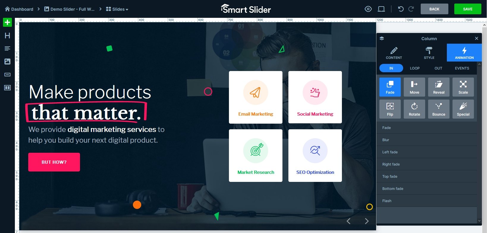
9. Animation & Effects
Smart Slider 3 offers a lot of animation & effects, already in the free version. With a nice background animation you can cheer up your slider, and with layer animations you can grab your visitors’ attention and make a modern and good-looking slider.
Set your layer animation at the Layer window
Also you have an option to create an auto playing slider. This way you can share more content with your visitors, but you should take care of the slider autoplay interval, and always give a control for the user to stop it.
Get on board! Join our 142,416 subscribers!
Get our latest news, tutorials, guides, tips & deals delivered to your inbox.
No spam. No charge. Just curated emails.
Conclusion
Smart Slider 3 has a lot of settings with which you can create a stunning slider. And if you know the points what you should pay attention to, creating a slider will be fun. Use optimized images, fill the alt tags, and check the result on different devices, and your slider will be an important part of your page. It’s also worth the time to check our tutorial videos and take a look at the settings in the slider examples, by which you can learn a lot.
I’m Bernadett Toth and I’m a member of Nextend‘s support team. I have two dogs, in my free time I teaching them. Besides that I often ride a bike, watching movies or reading.